There are new charts being delivered for Power BI every month. In all shapes and colors… yet we are going back to basics with our custom visuals.
The main library will consist of the most imporant graphs. The ones I would like to use every day, but at the given moment am not able to find the right solution. The list is quite short actually:
- Laconic Card Visual
- Laconic Line Chart
- Laconic Bar Chart (both horizontal and vertical)
Would you believe this can be enough to build 90% of dashboards and reports?
The very first visual which is already in the works is the Laconic Card. It is based on the original concept of the Card in Power BI. We are just adding the possibility to show a little bit more information in it.
The main things that are missing in the original Card of Power BI:
- Anchoring of the value
- Evaluating the gap
- Immediate understanding whether what I see is good or bad
Anchoring means looking at some other related value. This could be Last Year, Previous Month, Budget or Target values. Anything that helps your business users have a better understanding of the main KPI value displayed in the Card.
Evaluating the gap should be very easy for both report developers and consumers. Laconic card makes it easy by plainly showing measure values in the card. No tricks, no smart behaviour. Nothing. We leave full controll to the developer to send in what ever value is to be displayed. Build your measure and we will show it.
Red light means something is wrong. In a dashboard full of numbers and charts nothing draws the eye better than a red dot. Again- you get full activation controll via a measure. You decide when to show it and when not to.
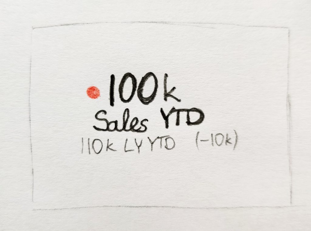
With all of that said, how will it look? Well, here is my original sketch of the visual.
Main value and name of measure/KPI are in bold. Red dot to get the attention. LY YTD value is for achoring and (-10k) is evalueation of the performance. All in a clean and easy to understand format.
Why I don’t like other custom Card visuals available today? Well, in most cases they are too cluttered and try to be too clever. I want my cards to be as clean and to the point as possible. I want to pre-calculate values in DAX and expect them to show up in the visual, but most cards will try and calculate the variances themselves and this is just not intuitive.
Therefore today it is a choice between the built-in card and making our own. Own it is. And soon you will be able to try it out.