Scientists estimate that up to 50% of our brain is involved in visual processing. So, while dogs rely on smell and bats’ echolocation, humans rely on sight more than any other sense. Incidentally, this is also why having relatively poor vision isn’t actually the death sentence you might think it would be in the wild. Seeing a lion in perfect clarity is much less important than seeing it at all.
What are we getting at here? We’ve designed a world around our dominant sense, with visuals everywhere, and the business world is no exception. Data visualization is a hot topic in business, with seemingly everyone striving for prettier and prettier visuals—the bolder, brighter, shinier, and more visually unusual, the better. However, like with everything, you can go too far and end up detracting from the very message you’re trying to convey.
With this in mind, let’s look at the difference between data visualization and data reporting.
The Importance of Data Visualization and When It Goes Too Far
We all like looking at stunning Power BI graphs, but it’s essential to recognize why they exist in the first place. At its core, the goal of data visualization is to display data in a way that makes its insights accessible. A pretty graph or chart is no use if you can’t instantly interpret what it’s trying to tell you.
And this is the crux of the issue of data visualization today. People have become so focused on what looks good and less focused on how useful it is in the real world. Data is critical in business. It’s how we know where we were in the past, where we are now, and where we’re heading in the future. It’s how we make critical business decisions that could transform revenue and reputation.
For high-ranking employees like CEOs and directors, time is also a critical factor. They often have to make decisions without the luxury of burying their head in the data for hours. If a decision-maker has to ask for additional data to understand the graph well enough to make a decision or is so overwhelmed with information they can’t find the key patterns, then it’s failing at its job.
With some Power BI dashboards, you get the impression that the goal is more “how many visuals can we cram in here” than “are we conveying the most critical data?”.
But how do you achieve balance? How do you create a report that people want to look at while staying true to the data?
Creating Functional Visual Data Reports
Best Practices for Accessing Insights
When it comes to creating highly functional data reports, the importance of minimalism can’t be understated. According to professor and scientist Steve Franconeri (@SteveFranconeri), decluttering your graphs and sharpening their focus makes you look more professional and leads to better memory for key data patterns. In other words, minimalism improves your ability to access insights in the data.
As evidence of this, let’s consider the 2021 paper titled Declutter and Focus: Empirically Evaluating Design Guidelines for Effective Data Communication. As part of the study, participants were asked to redraw previously seen visualizations, recall their topics and main conclusions, and rate the varied designs on aesthetics, clarity, professionalism, and trustworthiness. The results were conclusive – designs with less clutter achieved higher ratings for aesthetics, clarity, and professionalism, leading to better memory for highlighted patterns.
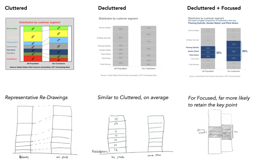
But what constitutes decluttering? The main principles were:
- Removing non-critical gridlines.
- Eliminating excessive labeling of data values.
Beyond simple decluttering, several other factors served to improve focus:
- Using a clear headline that describes the relevant data pattern.
- Highlight a subset of relevant data with a different color.
- Connecting data values to written annotations to help contextualize them in a broader narrative.
When it comes down to it, the best visual designs help to support the way your brain works. We already know that our brains have an excellent capacity for visual processing, but that isn’t the only type of processing that needs to happen. For your brain to process the image as a whole and walk away with the right information, the information needs to be presented in a specific way. It needs to help you spot issues instantly and start coming up with solutions.
For example, consider the following images:
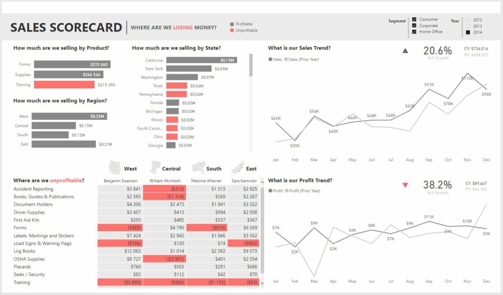
Source: https://community.powerbi.com/t5/Data-Stories-Gallery/Sales-Scorecard-Where-are-we-losing-money-by-Decisive-Data/td-p/104653
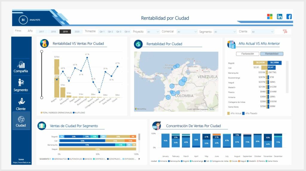
Source: https://community.powerbi.com/t5/Themes-Gallery/Profitability-Report/td-p/1456116
At first glance, you’re probably more drawn to Image 2. It’s got a lot going on for your eyes to feast on – it utilizes lots of colors and different types of graphs and maps. It’s maxed out in variety. In other words, it looks more fun. In contrast, Image 1 looks decidedly less fun.
However, the data report in Image 1 is much more practical and therefore much more useful for everyday use.
Think of it this way: Image 2 is like a buffet – your eyes scatter over all the various foods on display with excitement. You see stuff you like, but you don’t see everything, and sometimes you’re not even sure what you’ve seen. And when you get back to your table, you look on in envy as you realize your friend has hot wings you missed entirely. Image 1 is more like a carefully crafted menu – everything is in its appropriate section, and you know exactly where you need to look to find your favorite dish.
Other Principles For Functional Minimalism in Visual Report Design
- Don’t waste space by overemphasizing unimportant content.
- You should be able to see visual trends as well as precise values. Precise values are often critical to decision-making.
- There should be an appropriate emphasis on current vs. historical values. If historical values are an essential part of the visual storytelling, then include them, but ensure they don’t overshadow your main message.
- Simplicity is key. Cut out unnecessary visual content, no matter how pretty it looks.
Final Thoughts
When done correctly, data visualization becomes a powerful communication device that empowers us to focus on the data in front of us and process it with clarity. However, in the wrong hands, tools like Power BI can lead to cluttered graphs and charts that look pretty but lack real-world usefulness. To strike the perfect balance between practicality and stunning aesthetics, minimalism is key.
Thank you for the information