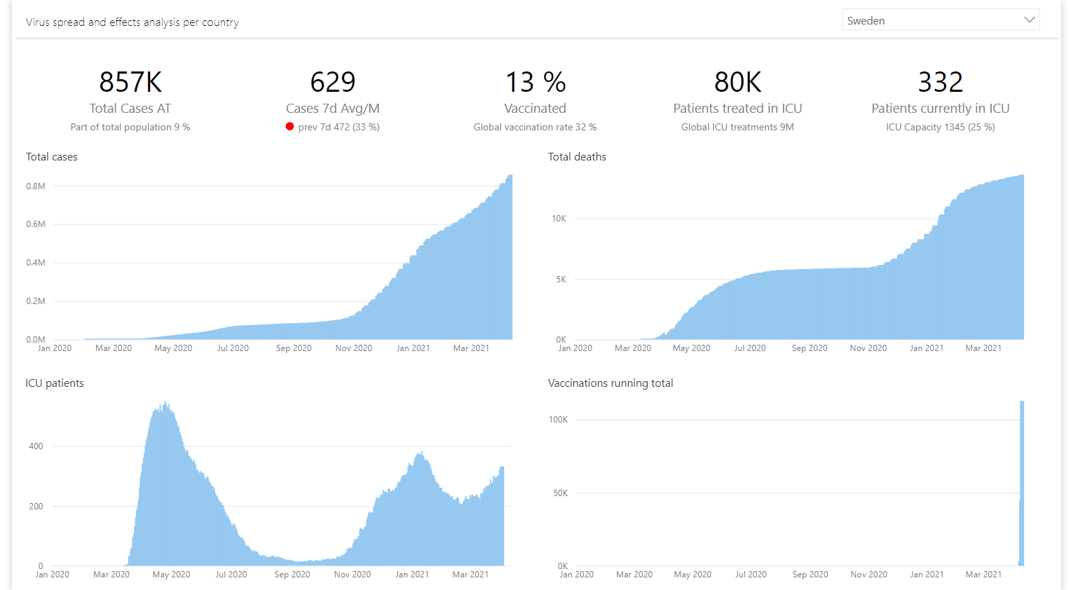
Few reports are made without at least a couple of main KPIs being shown as plain BIG numbers. Starting to tell your data story with the KPI values and then elaborating with the details of where the values came from is a great way to create a flow in the data analysis.
As in the example below we see a COVID-19 report. Here the main KPIs are listed on top of the report and the supporting metrics are then further detailed by day in the 4 charts below.
Power BI and all the companies creating custom visuals offer quite a few options to consider when it comes to cards. If you search AppSource for “card” you will find (at the time of writing this post) 18 different visuals to choose from. Everything from extremely specialized cards for showing images and HTML content to the “Swiss knife”-like visuals that try to cram all possible options and settings into one single object.
In this blog post I will go through the cards I or my colleagues use(d) mostly and give you a brief summary of what they lack and what they are good at. In the end we will look into Laconic Card PRO and from the other card summaries you will see the reasoning why we created this visual in the first place. Hopefully this makes your job as a report developer a bit easier.
Contents
A little note before we dive in- I’ve added the yellow background behind the cards just to have a reference of their size and shape.
Power BI built in Card

A great, simple and extremely easy to use visual. Does the job of clearly showing the value right out of the box. And it even has some conditional formatting options (as you can see in the third card the value is red because the rule is set to change font color to red if value > 0).
However it’s simplicity is also a great weakness. It is just too basic.
The main problem being the lack of context presented to the report consumer. Since it is only possible to show one single measure at a time and contextualizing your data is a crucial ingredient in great report design, you will end up using multiple cards next to each other (as in example above) or overlaying them and having a hell of a time trying to align everything perfectly.
This workaround of adding multiple cards also leads to report performance degradation. On every report page you only want as many visuals as are needed to tell the story.
As clean and easy to use as it is, the built in card is likely to be too basic to give a good user experience.
+ Pros
- Does not require custom visual installation
- Simple to use
– Cons
- Only one measure per visual
- As consequence of previous point it slows down the report
Card with States by OKViz
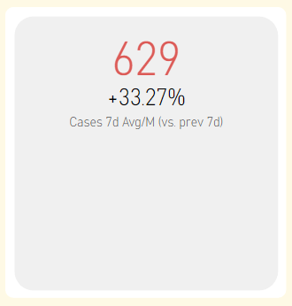
This is probably the Swiss knife of cards. There are tons of settings and presets and they all look well designed. Card with States should likely require a blog post of its own just to explore all the possibilities it provides.
A great thing about this visual is its ability to generate multiple cards. When a category is supplied, then it will replicate itself showing same measure for different category values. You can also throw multiple measures and corresponding targets at it.
What if one of your KPIs shows % value. Say Gross Profit % (90%) and you want to compare it to Gross Profit % Last Year (80%). In my world you would show the percent point difference between the two years (90-80=10%), but the built in calculation is doing a % diff between the years (90/80 – 1 = 12,5%) which is less than optimal when developing business dashboards. Hold on, you say, just change the data label settings to show “Change over target” you say. But I don’t want that for the other 4 cards in my dashboard! So I loose the ability to generate multiple cards and have to add 4 separate objects to my report.
One more visually appealing feature of this card is the ability to generate trendlines. However, I never really got them to work in a practical enough way. And most of my clients are not into tiny line charts. It is either nothing or a normal line chart that works for them.
Every bit of this visual is flexible and/or automated in one way or another. And as it might be cool for a visual developer to cram all this functionality into one card, it does get complicated very quickly. Complicated, hard to predict and not necessarily the way you want your report to work.
If you have any good examples of how you use the trendline in a card and are willing to share, do let everyone know in the comments below.
A final note on this viz- it has a ton of features but lacks documentation. So if you want to use it, you will have to experiment your way through it. Here is their own video showing some of the features:
+ Pros
- Flexible
- Can generate multiple cards per category
- Trend line
– Cons
- Built-in diff calculations are not necessarily what you might want
- Lack of documentation
Ultimate KPI Card
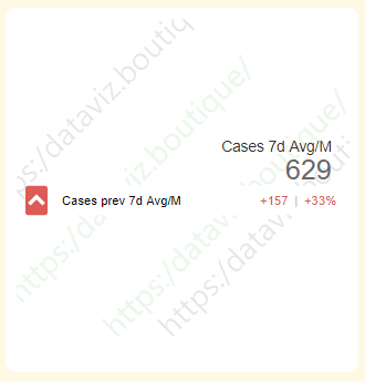
This card is quite nice if you are forced into the situation when you need to show multiple reference values for each card. Ultimate KPI Card is able to show up to 3 of them. To be honest, I don’t believe that a KPI should be evaluated towards 3 different measures at all times. I would consider challenging the subject matter experts and try to crystalize the report requirements before I continue.
In general the design is clean and simple. You can change the behavior and colors of the comparison values so that it lights up with the right color.
It does suffer from the same auto-diff calculation issue as the OKViz card. So not that great if you have to work with % values.
The main issue with this visual is its price and license model. It is some complicated scheme with credits which you buy and then divide between report authors and report users. I have not been able to find a clear instruction of how this is intended to work. If you know any more details about this, please share in the comments.
+ Pros
- Clean design
- Multiple reference values per card
– Cons
- Pricey
- Only works with categories, not multiple measures
Advance Card

Advance Card is here as an honorable mention. Mostly because some colleagues of mine like it for its Prefix and Postfix settings. It is easy as in the example above to add text “Days” to the end of the value.
I personally prefer to just add that in the measure definition. DAX code for suffix could look something like this:
Total Supply = FORMAT([Total Supply Calculation] , "#,#") & " Days"So what ever value comes from Total Supply Calculation measure will be converted to text and word Days will be added to it.
This visual has some extra formatting options such as rounded corners (you can select which ones and how much you want to round up). But there is no way to add multiple measures or to have any proper reference values so usability of this visual is quite limited.
+ Pros
- Built in prefix and suffix handling
– Cons
- Only one measure displayed at a time
Laconic Card PRO
Before launching Laconic Card PRO my go-to tool for KPI visualization was the built in card. I did use (or test) the other visuals now and again but rarely if ever did they get used in production. Main reasons for that being the poor performance and complexity of the visual or price point/license models that are all over the place.
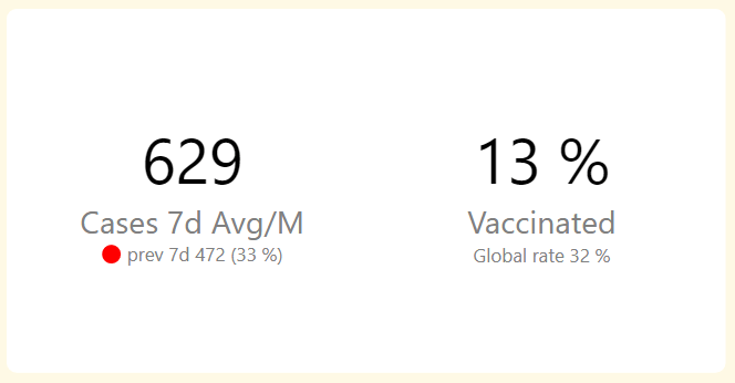
Laconic Card (both free and pro) is created with the built in card in mind. It is formatted and ready to go by default. Just adding the few missing ingredients to make it a perfect KPI Card. You are able to display a reference value and the weight of the reference for every measure. Also, by adding calculations to the Problem Flag field you are able to display the red dot and get the report consumers to pay attention to the specific KPI.
There are no calculations built into the visual. It just shows what ever you supply to it via the measures.
Multiple sets of measures generate multiple cards within the same visual.
Our license model is straightforward- all features are enabled all the time. To remove the watermark, purchase a license key and use it within your organisation for a year. Then renew it if your company benefits from using our product. Easy as that.
I do have to note one potential downside of using Laconic Card PRO- it does not currently generate a card per supplied category. It only works with specific measures for each card. If you would like to see this (or any other) feature implemented in Laconic Card, do let us know in the comments below.
+ Pros
- Minimalistic design
- Straightforward usage
- Values presented as they are in measures
- Good price point and model
– Cons
- Does not generate cards per category