As a small case study for our Laconic Card custom visual for Power BI I will look into enchancing an existing report. We will look into some of the flaws in the existing design and also make use of Laconic Card to provide the users with more information.
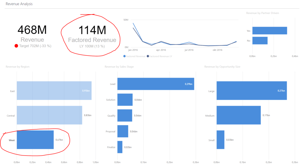
Here is the end result:
For this example I’ve downloaded a sample report from Micsrosoft docs:
We will only focus on one page from this pbix file which is Revenue Overview:
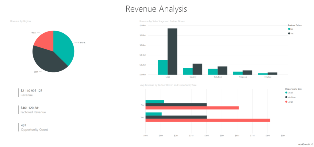
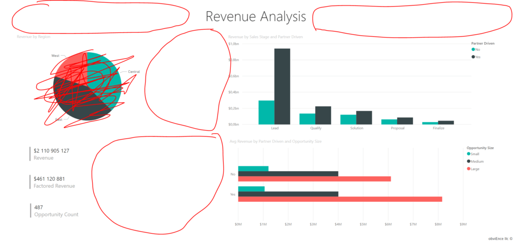
There is a whole heap of things that are wrong with this page. Some of those are:
- Too much wasted space (marked areas in screenshot below);
- They used a pie chart. It is worthless;
- The bar charts clump together two attributes and become cluttered;
- The tiles have no anchoring point, making it hard for users to interpret the values.
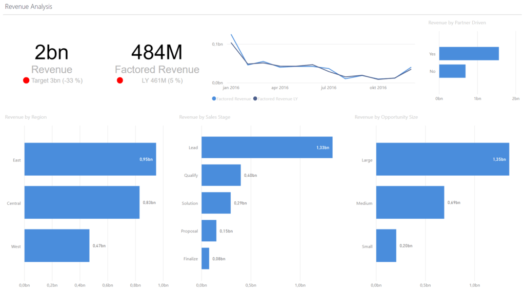
All of thesse issues are fixed by our new design.
- Have used all of the space.
- Converted the useless pie chart into a bar chart which allows us to efortlessly compare the performance between regions.
- De-cluttered the two bar charts by sepparating them into 3. Now users can click on bars and see how each category affects the other ones. Filtering in Power BI is awesome. As a consequence I am able to use one color in all of the graphs thus decluttering the eyesight even further.
- I use laconic card to show the main values which can now be compared to targets and last year. These are perfect examples of anchoring the users perspective- making it easy to understand if and how much we’ve grown or have left to go to target.
- The flexible control of the red warning dot enables us to customize when it is showing up.
The Factored Revenue is considerred to be an issue if yearly growth is less than 10%. Therefore this is the DAX formula for problem flag:
Factored Revenue LY Problem = IF([Factored Revenue vs LY] < 0,1; TRUE();FALSE())