Laconic card focuses on delivering your KPI information in the clearest possible way. Design of this visual is minimal and clutter free. It is not possible to change too many things about the layout which means you do not need to wear out your mouse to make it work.
The visual is not doing any calculations, only displaying measure values as they are, giving you full control over the information displayed in it.
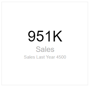
Mandatory fields:
- Main Measure.
Optional fields:
- Comparison value (shown under the main measure);
- Comparison weight value (shown in brackets () next to comparison value);
- Problem Flag (boolean true of false that generates a red dot next to comparison value).
Laconic Card vs the built in card
Main reasons to choose Laconic card vs the Power BI native version of Card:
- Clutter-free design by default;
- Two additional measures for anchoring and comparing values;
- Problem flag indicator;
- Better total report performance (see “More on performance” below).
More on performance
Power BI renders each visual element (be it built in or a custom visual) sequentially. This means that the more items you have on your report page the longer it will take to generate the whole page.
This normally is not an issue except for the times when you would like to customize your KPI dashboards full of cards with even more details, such as comparison values and color coded dots.
When you create a KPI Dashboard page with a matrix of 3×5 built-in card visuals in it you end up with 15 standard cards. That already generates a substantial overhead since there will be 15 sequential queries fired off towards your data source.
But now you want to compare every value to LY, show % deviation next to actual variance plus draw a red dot next to the value that is not reaching the goal. And you end up with another 3 items for each of your 15 cards. When using a built in card you end up with a total of 60 queries executed sequentially and 60 items that need to be generated on the report page individually.
Depending on your data source response times this will either be slow or useless to your users.
Our solution to this issue is Laconic Card. With all of the extra measures in the report you still have 15 active items in it. This is enough of a difference to stop your users from complaining about Power BI report performance and help them focus on the important issues instead.
In case you actually have a report with many Card visuals in it, you might want to slice another 10 seconds off the rendering time by using the Laconic Card PRO version.
Where do I get it?
You can now download and install this visual directly from AppSource within Power BI by searching for Laconic Card. Read more about it in this news article:
More screenshots
Here are a few more screenshots where various combinations of measures are used in Laconic Card: